I have talked about the importance of drawing, absolute key to the connection of your passion for the subject matter and the painting. Now, how do I get my painting to be dimensional, to have depth? Your use of color and understanding all its principals is one of the answers.
Using a limited palette will give you an opportunity to deeply understand the colors you use and how they react together, you will know, as you view your subject, exactly what you need to use in order to make the hue you need for the painting. I can make a promise to you that you will never make mud, but beautiful neutrals.
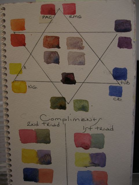
I use the triad system, two sets of red, yellow and blue, with two extra greens. I only use Winsor Newton watercolors. The first triad consists of Rose Madder Genuine, Aureolin and Cobalt Blue. These colors are very transparent and totally liftable. They will not go past 50% in value. The second triad is Permanent Alizarin Crimson, New Gamboge and French Ultramarine Blue. These are also very transparent, but staining. They can take a painting to 100% in value. The two greens are never used as green but combined with reds to make beautiful greys and blacks, or added to a blue and yellow to make that variety of greens you see in nature.
Color Wheel and Compliments
To the left is a rudimentary colors swatch of those that I use with the first triad on the right of the points on the triangles and the second triad on the left of the points of the triangles. In the center are the neutral, browns and grays made with both triads. The variety of hues that can be made with these colors is just extraordinary.
Compliment are an important way to add dimension to a painting. Nobody knew this better than George Seurat, a post impressionist who invented Pointillism, using dots of color who’s hues were complimentary, fooling the eye into movement. The compliment of red is the combination of the other two colors, blue and yellow (green), the compliment of yellow is the combination of the other two colors, blue and red (purple), the compliment of blue is the combination of the other two colors, red and yellow (orange). They must be right beside each other and they must be of the same value.
Value is another important way to make your painting dimensional. I always talk to my students in terms of percentage of value about their work and so we can always be ‘on the same page’ when discussing ways to improve it. Below is a quick value study of red, blue and yellow, using my palette. It is a good idea to do this so that you know how much pigment versus water to add to go up each 10% of value.
I have a friend who has a PHD in Color Theory, so we know there is a great deal to learn about its impact on our lives. This is only a small but important aspect focusing on dimension.
